Six of the Best: Helmet designs

With the 2015 regulations stipulating that drivers have to retain their helmet colours across the year, F1 may be set to return to a time when a racer's helmet colours were as much a part of their identity as their personality or driving style.
In recent years many drivers have embraced the habit of changing their helmets on an almost race-by-race basis. Whether driven by marketing tie-ins (Vettel's Red Bull Stratos helmet, Heikki Kovalianen's Angry Birds effort or Eddie Irvine's roaring Jaguar), personal tributes (Lewis Hamilton's Bob Marley design, Jean-Eric Vergne's Francois Cevert homage or Kimi Raikkonen's James Hunt replica), marking topical events (Michael Schumacher's '20 years in F1' gold effort, Nico Rosberg's World Cup celebration) or just taking part in the annual helmet design jamboree that has become the Monaco Grand Prix, the constant cycle of change has made it difficult to readily identify any of today's crop with a particular design, motif or colour scheme.
Lewis Hamilton became the first driver to fall foul of the new rule when he couldn't use his Petronas-colours inspired lid at the Malaysian Grand Prix.
And therein lies the point. The FIA see consolidated helmet designs as a way to both help fans quickly identify drivers at a casual glance and help the drivers 'build their brands'. Marketing guff aside, any drivers casting for inspiration as they come to design their new lids could do worse than look at the six classic helmets detailed below for inspiration.
Additionally, we would love to know if there are any helmet designs out there that you are particularly fond of... if so, leave your comments below
 |
| Ayrton Senna incorporated his beloved Brazil into arguably the most iconic helmet in the history of F1 |
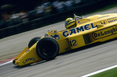
Ayrton Senna's helmet remains quite simply the most iconic design in Formula One history. As with any consideration of Senna, it's difficult to separate the objective truth from the easy trappings of evocative myth making, but his helmet colours were an integral part of the legend - the identifying symbol of his personality with which any of his on-track deeds are visually associated.
As with many drivers (more on this below), Senna's choice of colour scheme came about through a simple amalgamation of the colours of his national flag: green, yellow and blue (often appropriated as navy or black in Senna's design). The classic configuration of all yellow with green and blue stripes top and tailing the visor was first crafted by revered Brazilian graphic designer Sid Mosca, who also designed renowned helmets for Emerson Fittipaldi and Nelson Piquet.
By placing the emphasis on the yellow of the Brazilian flag, Mosca and Senna created an icon. Whilst not the first or only driver to sport a yellow helmet, Senna's prodigious talent and the simple contrast of the bright yellow with his black JPS Lotus or the red and white Marlboro McLaren created an instantly identifiable visual totem.
It was often said that in Senna's pomp the sight of the yellow helmet looming in a driver's mirrors would act as an intimidating warning, be it to a backmarker or a rival, that the Brazilian was coming through. Michael Schumacher's scarlet helmet at the wheel of a Ferrari in the early 00s was perhaps the only other combination in recent memory that carried such a weighty psychological aura.
If imitation is the most obvious form of flattery, then Lewis Hamilton's adoption of Senna's colours throughout his formative years is an obvious tribute to an icon. However, Senna's helmet stands alone; an almost anthropomorphic manifestation of his bold aggression behind the wheel, and an enduring emblem of Formula One's most revered driver.
 |
| The man may have been larger than life, but his helmet was an art of subtly |
Very little about James Hunt's life or racing career could be described as simple or modest, but his easily identifiable helmet was certainly a masterpiece of economic design.
Drawing upon a jet black canvas, Hunt added thin bands of blue, yellow and red (representing his Wellington School colours) retreating backwards from the visor and, most strikingly, his name in heavy white block capitals. Underneath his name Hunt frequently incorporated the Goodyear logo, but this was sponsorship at its most tasteful: a single, small motif in harmony with the overall design - in contrast to the many glaring brand insignia competing for space on modern day helmets.
Hunt was far from the only driver to have his name emblazoned across his helmet and nor was he a pioneer in the field, with Jacky Ickx, Francois Cevert and Niki Lauda among those who preceded him. However, Hunt's helmet, like Senna's, bore a closely symbiotic relationship with his driving style and persona - physically manifesting Hunt's natural aggression and uncompromisingly authentic character.
It's no secret that Kimi Raikkonen (who has entered snowmobile races under the pseudonym 'James Hunt') has a reverential admiration for Hunt, and it was Raikkonen who resurrected Hunt's classic design for the 2012 Monaco Grand Prix. Kimi's homage served as a reminder of the distinctive simplicity of Hunt's design, and it's fitting that the most distinctive personality of Formula One's modern age pays overt deference to perhaps the most unique character in the history of the sport.
 |
| De Angelis used a cursive script which reflected his stylishly cultured debonair nature |
It's easy to think of the modern closed-face helmet as a template of fixed design variables, but one driver who created an icon by the simple virtue of enhancing the classic 'goldfish bowl' spherical template was Elio de Angelis.
Predominantly white, with two thick adjoined black and red stripes wrapping around the circumference at visor level before cutting down at a 45-degree angle, de Angelis' helmet was a classic design in and of itself. Like James Hunt, de Angelis also incorporated his name into the design - although the Italian used a cursive script which reflected his stylishly cultured debonair nature.
The feature that elevated de Angelis' helmet to true icon status though was the box-like grille over the mouth, akin to a BMX racer, which gave his entire head an otherworldly and alien appearance from any angle. Added to this, De Angelis also frequently incorporated a triangular bridge at the top of the box, which served the purpose of cutting into the visor and making it appear almost as though de Angelis was some kind of wrap-around sunglasses sporting apr?s-ski Stormtrooper.
Though de Angelis was tragically killed in a testing accident in 1986, his colours lived on in Formula One after being adopted by Jean Alesi. Alesi though didn't take on the mantle of the 'box chin' - meaning there's a gap in the market for an opportunistic retro hipster to take to the grid sporting one of F1's forgotten design classics.
 |
| Bold, brash and arguably garish... Jacques Villeneuve's choice of colours were at least distinctive |
The process of directly linking personality to helmet design is typically a process of extrapolation and association, but not so with Jacques Villeneuve. Perhaps the most loud and brazen helmet in F1 history certainly reflected the outspoken, brash and daring nature of its 'brattishly punky' incumbent.
Incorporating a V-style swoosh on either side which bore stylistic resemblance to the inverted V on his father, Gilles', helmet, Jacques chose a garishly distinctive combination of colours to create a unique identity.
Starting with a base layer of dark blue, Jacques added stripes of pink, yellow, racing green and red, of varying thickness that wound around the V shape with ever diminishing returns. Villeneuve unsurprisingly apparently came up with the design while doodling on a drawing pad, with the colour scheme purported to be based on a sweater his mother, Joanne, used to wear in the paddock at Gilles' races.
The colours clashed horribly, and when combined with the garish liveries of the '98 Winfield Williams or the 'half and half' '99 BAR the visual effect was quite overwhelming. But therein lay the point; Villeneuve's design was never about aesthetics, and as an expression of individuality and character it was an apt manifestation of his personality.
 |
| Eddie Cheever celebrated his origins with a typically patriotic helmet design |
The incorporation of a driver's national flag, colours or heritage into their helmet is as old as the idea of helmet design itself. From Jackie Stewart's tartan band through Cevert, Lauda, Prost, de Cesaris, Boutsen, Frentzen and Button to name just a small random sample, national pride has often been the cornerstone of a driver's creative application.
American driver Eddie Cheever took this motif one step further however by combining the colours of his home country with the flag of his home state to create a boldly distinctive patriotic design.
At a fundamental level, Cheever's red, white and blue 'stars and stripes' colours are as wholesomely American as hamburgers at Homecoming. It's the manifestation of the Arizona state design though that makes it so idiosyncratic. The Arizona flag incorporates a single copper star at its centre, with the top half fanning out in red and yellow stripes across the width of the flag.
Cheever applied this idea of a central star on either side of his helmet, with five white stripes protruding from each point of the star and cutting through the red and blue horizontal halves that constituted the base layer of the design.
The angle of the stripes is what makes Cheever's design stand out. With so many helmets constituted around more ergonomically pleasing horizontal elements, Cheever's blend of diagonal stripes offered a boldly pleasing and easily identifiable twist on the flag design staple. The fact that Anthony Davidson unashamedly plagiarised Cheever's design some years later shows that Cheever's helmet was perhaps the most influential part of his decade-long F1 career.
 |
| Simple but recognisable, the 'Hill design' made its presence felt through the eras of F1 |
One of the most unusual sources of design inspiration also served to create one of the most instantly recognisable helmets in motor racing history, and an icon that was borne by father and son to world championships almost 30 years apart.
Graham Hill was one of the first drivers to become synonymous with his helmet colours, and from the start of his motor racing career he sported the dark midnight blue and white oar blades of the London Rowing Club - for whom he had competed to an international standard during the 1950s.
In Graham's day, open-face helmets were the norm, and the design, with its eight short blades pointing upwards around the circumference of the top dome of the helmet, was a perfect fit for a much more limited canvas.
When Damon Hill started his racing career in motorcycling in the 1981, he too sported the family colours in tribute to his father. When Hill reached Formula One in 1992, it marked a return to the grid after 17 years for one of the sport's classic totems. When Damon won the world championship in 1996 he became the first second-generation champion - and the colours of the London Rowing Club became the first design to be borne to the title by two separate drivers.
Damon's son Josh would also adopt the 'family' colours for his short-lived racing career - ensuring that the iconic Hill helmet design lived on for a third generation.
These are just our selections, but we would love to know if there are any helmet designs out there that you are particularly fond of... leave your comments below


