Stripping down the OrangeArrows livery.
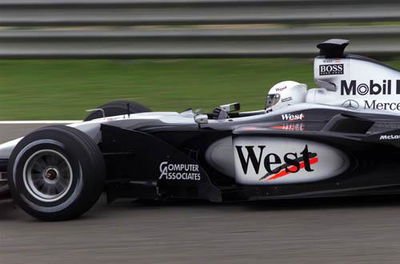
The first, and most public representation of an F1 car is its livery - the outward colour and design scheme will immediately identify which team you are looking at. At its most effective, the livery becomes almost one with the team - as classic as Ferrari red or as iconic as the John Player Special Lotus but, get it wrong, and the memory may not linger longer.
The first, and most public representation of an F1 car is its livery - the outward colour and design scheme will immediately identify which team you are looking at. At its most effective, the livery becomes almost one with the team - as classic as Ferrari red or as iconic as the John Player Special Lotus but, get it wrong, and the memory may not linger longer.
As with nearly every element of contemporary F1 design and engineering, creation of the team livery is a minutely detailed and complex process, one that does not stop when the cars head on to the track at Melbourne at the start of each season.
''Sometimes it's quite difficult to devise a livery unless you have a title sponsor,'' explains Giles Puleston, head of graphics at OrangeArrows, ''If you do have a title sponsor, like we have had with Orange this year and last year, then you can build the livery around a basic colour scheme. Last year's livery was a real start from scratch design job, whereas this year's was very much an evolution.
''When Orange came on board, the nature of the deal meant we had no luxury of time to get the livery developed. We had a series of concept ideas which we proposed to them and, through the course of negotiations, it came down to two main requirements - maintaining black as an Arrows colour and a colour which was neutral for other people to be branded on to, and incorporating orange for obvious reasons. With Orange, we probably went through 250 concepts over a period of 36 hours, constantly tweaking certain areas on the car.
''Of course, it wasn't simply a case of satisfying Orange. We had a situation where we already had four major sponsors that had signed contracts with branding areas. So what we then had to do was convince the other sponsors to concede a little bit of their brand identity so the overall livery could remain strong and aesthetically pleasing.''
But even then, it's not as simple as just putting logos on to a different coloured background...
''Branding a F1 car is such a unique medium,'' Puleston continues, ''When any global corporation develops their corporate branding guidelines, they are not designed for going on to F1 car. They are designed to work on things like billboards and TV commercials.
''All the work undertaken by the graphics department comes from established guidelines and their intrinsic understanding of how liveries work, including a knowledge of what can be achieved from paint and what is able to be done within a short time frame.
''Usually, we wouldn't design anything that involves airbrushing, special paint colours, or a special livery process because we need to turn the cars around quickly.
''We use Adobe Illustrator for the design process. We have a two-dimensional template on the computer - a sideview and plan, or overhead, view, which means it's a quick process to put the brand identities of the sponsors on the template and develop a livery from that. We can do designs by hand, drawing the concepts and then transfer them, but mostly we go straight on to the templates.
''We make the decals ourselves. We are given a logo which then goes through a vinyl cutting process. The shape of the logo and lettering is scored out on vinyl and made into a transfer. Traditionally, if we had a multicoloured logo we would cut different layers of vinyl for each colour and lay them on top of each other to make the logo. More than cost or manufacturing time, however, the weight involved in that was a big issue. What we have now is a special machine that actually prints the logo colours and cuts them out so we can have a multicoloured logo as a single layer and as a vinyl cut graphic.''
Weight is also a major issue when it comes to the actual paint job for the car. In order to keep the amount of paint on the car to a minimum - just 75 grams in total - the team use only three to four, incorporating a base coat, one or two layers and a lacquer. Because of this restriction, the graphics department has had to invest a huge amount of time in finding exactly the right shade of orange - one which will stand out not only on the track, but also on television.
''We physically sprayed about 26 shades of orange to find the right colour to work from,'' Puleston admits, ''At one point, we actually had the car sprayed with twelve shades at once just to get an understanding of how the orange colour would work on the
car.''
The car itself is only one part of an entire graphics programme which cuts across everything within the team, from firesuits and team clothing all the way through to trucks and pit cladding. If a logo changes, that change needs to be replicated not just on the car but on up to 200 other elements. So, the responsibility of graphics is not just to create a strong brand image for the car, but also to reflect that brand image across the team.
''Our goal is to try and create something visually strong enough and aesthetically pleasing so that when people are talking about F1 generally, they use OrangeArrows as the example,'' Puleston concludes.


