How do you design a Formula 1 car livery?
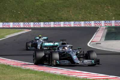
As important and as intricate as the chassis design of a Formula 1 car can be, the most explicit way fans will view them is through their liveries and colour schemes. Upon the launches of F1 cars each February prior to the start of on-track testing, most will eagerly wait to see what the grid for the year ahead will look like.
As important and as intricate as the chassis design of a Formula 1 car can be, the most explicit way fans will view them is through their liveries and colour schemes. Upon the launches of F1 cars each February prior to the start of on-track testing, most will eagerly wait to see what the grid for the year ahead will look like.
The challenge of designing an F1 car livery goes far beyond something that looks cool or eye-catching. A long list of requirements from sponsors, engineers and management must be met, making it an intricate task to keep everyone happy and produce something that still stands out.
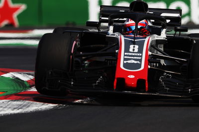
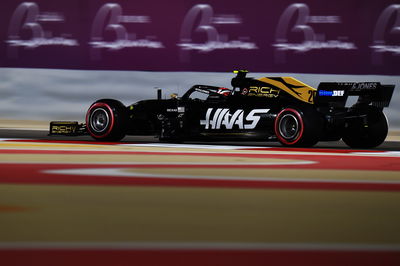
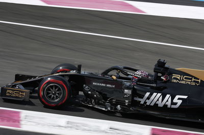
One of the biggest changes from 2018 to 2019 came at Haas, where the arrival of new title sponsor Rich Energy prompted a sizeable image change and rebranding. The task of incorporating the black and gold colours of the energy drink brand into Haas’ image lay with Ryan Long, the team’s creative services manager.
“That conversation sort of started happening around October,” says Long. “It was around the time I was starting to think it was time to get things rolling for 2019, and it was a matter of Gunther [Steiner] saying: ‘Hey, can you put together a sales presentation for a Rich Energy title sponsorship?’. One afternoon I knocked up what the team logo could look like and what the livery could look like, race suits, trailers, couple of other things - you send it off, like any other one, and that one came back: ‘OK, the deal’s signed quickly!’
"They liked all that stuff that I knocked out in an afternoon, but now it was about spending the whole off-season working on it. Normally in an off-season we rebrand a few things here and there, but this time it’s like almost everything we touch. It ended up being much bigger than just the livery in terms of workload.”
Indianapolis-native Long joined Haas for its debut season in 2016 after spending 10 years working at Indianapolis Motor Speedway and in IndyCar, becoming the series’ art director. With Haas, his role is straightforward enough to explain: “I always tell people it’s everything visual for the team. If you see it, I try to get on it. It’s team kit, it’s social media graphics, it’s hospitality, it’s garage branding, trailers, driver cards, VIP itineraries, letterheads, business cards - I’m a one-man team, so it’s just me doing all this stuff. I try to make everything hang together well, and I think the only way to do that is to get your hands on literally everything. It’s fun.”
The announcement of the Rich Energy deal in October coincided with when Long would have begun to properly formulate plans for the following year. The red, white and grey company colours Haas had ran with in its first three seasons made way for black and gold - leading to some obvious comparisons.
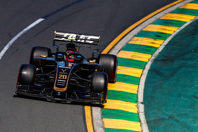
“When you look at the can, it’s pretty obvious that if you’re going to make a car that promotes their brand and looks like their brand - and everyone’s like: ‘Oh it’s going to be John Player Special!’" says Long.
“I’m not trying to copy it, but you look at their can and you translate that into a car, it’s going to have a certain look to it. We kind of looked at two routes. One of them was a more entirely black and gold car, and the other one kept some light grey. It was about making all the sponsors happy, honouring commitments and contracts that we already have.
“Having a new title sponsor is one thing, but Haas Automation is still a massive part of the team, so we have to balance making sure they weren’t giving up anything, because their level of commitment doesn’t go down. We’re adding stuff without Haas Automation losing anything. That whole thing is just a balancing act.”
Judgement from fans is always quick upon the unveiling of a new car, but for Long, the absolute priority is to create something that is functional, not solely aesthetically pleasing.
“It’s easy to make something that looks cool, but you’re juggling sponsor commitments and contracts that already exist before you even know this whole thing is happening and you’ve got to work those things in, and making everybody happy,” he explains.
“There are aero requirements too. There are 'no paint areas' on the car - you can’t put decals here, you can’t put them there, this area gets hot, this area is too sensitive - there’s a lot of that stuff. Also logistics and turnaround time. If you have a complicated scheme and it has a lot of paint lines in it, everywhere one of those paint lines crosses from one body panel to another, they’re going to have to make up a specific jig for that in the paint shop. If you’re a team that makes all your bodywork and does all your paintwork in the factory, that’s maybe not a huge deal. But for a small team, it is a big deal.
“You really have to be devoted to wanting to do something if it’s going to increase your logistical load that much. A good example of that are the wheels. I’ve seen a lot of people say it would be cool if the car had gold or black wheels. And we went down that route, but by the time we were confirmed enough to say let’s look into this, logistically it just became tough. Eventually Gunther said: ‘I’d rather definitely have wheels than maybe have gold wheels!’
“First priority is having what we need, further down the list is having it look cool. I think it’s easy for people to say: ‘They should have done gold wheels’, but if you only knew how many dozen emails went back and forth trying to make that happen. Producing artwork is one thing, and problem-solving is another. This is more problem-solving than anything else.”
In a bid to get an idea of how the final livery will look, Long will take digital renders of the chassis from the engineers before playing around with ideas.
“I get blank renders from our engineers, an all-white car and an all-black car, and I do a lot of photoshop stuff because that’s what I’m comfortable with,” he says. “Eventually we get into rendering stuff further down the line, but we don’t really use it to mock up what the car is going to look at in all these different looks. We could, but it’s just time consuming and expensive compared to knocking it out quickly. It’s easy for me to do a lot of iterations quickly the way I do it.”
As much as Long would like to see some more adventurous designs up and down the F1 grid, he is conscious of the challenges that his peers face - and, as history shows, sometimes simplicity is the best.
"Of course I can look at it and think: ‘Boy if I was the designer I would have done that...’ - but that’s what everybody does to me too, because they don’t understand the limitations that I was dealing with, and I don’t understand the limitations those guys were dealing with,” Long says.
“I do think a lot of the one-off and testing liveries are really cool, and I would like to see some more daring stuff like that. But same thing, maybe they can’t, maybe they have commitments to their sponsors that say they can’t do this cool thing that everyone likes because contractually they can’t make it happen.
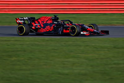
“The other thing I think about too is that there’s a livery that’s good for an unveil, to make everybody go ‘wow’, and there are liveries that work well on-track throughout the course of the season. I think you look back at some of the most famous stuff, JPS cars being one, the McLaren Marlboro stuff - that stuff is dead simple.
“If that had never existed and you did it today, somebody at the unveil might say: ’It’s kind of boring, it’s only two colours, it has these basic lines’ - but you look at it on-track and it’s magic. It’s one of those things that hangs around for decades as being iconic.
“That’s one thing to think about, what looks cool when the cover comes off, and what looks cool over the years and over the season.”
Designs that stand the test of time are the holy grail for designers such as Long, who picks out two creations from his career as personal favourites.
“I really like the 2018 car that we did here,” he says. “After looking at something else for a while and looking back at it, I think it worked out really well. I really liked the full scheme of 2018 branding that we did across the board, social media graphics, everything. I think everything really hangs together really well, and that was the most mature total package that we did.
“Looking back, I did the 2010 Indy 500 logo and race ticket. That’s one of those events that is really special to me and is really cool to know that someone will be flipping through a book 50 years from now and they’ve got that logo in there. It’s cool as a designer to do anything that gets a lot of eyeballs on it, or it’s something that sticks around for a lot of years.
“Those projects, they have both, which makes me happy to see that stuff live on.”
