What MotoGP must do now to cash in on Silverstone’s retro fever
The excitement around retro liveries is something tangible for Dorna to cash in on for future years
Pedantry will tell you that the 2024 season is actually MotoGP’s 76th year of competition. That’s an argument to be had among yourselves. For all intents and purposes, this is the 75th anniversary of the grand prix motorcycle world championship and the British Grand Prix was seen as the fitting place to celebrate that fact.
Which, in all honesty, is a bit odd given Dorna Sports’ tendency to do whatever it can to ignore the fact that the genesis of the championship it now controls was the Isle of Man TT in 1949. The TT, of course, hosted the British GP through to 1976 before it moved to the mainland the year after.
The championship as it is now is a far cry from the one Brit Harold Daniell became the very first premier class race winner of - the most glaring difference at Silverstone last weekend being the lack of UK riders in the MotoGP class. Jake Dixon gave the home fans something to cheer about in the Moto2 race, though its positioning on the bill to run after the main MotoGP contest on Sunday somewhat dulled what should have been a major celebration.
In general, MotoGP’s big birthday bash fell somewhat flat. There weren’t any on-track parades of classic machinery, not many MotoGP legends milling about to revel in this moment of history they helped create, nor was any of it done in front of a particularly big crowd: just 117,867 turned up across the weekend, with a lacklustre 42,529 Sunday spectator figure.
The move to have every team field a retro livery at the British GP was an inspired one, though, as was unveiling all of them in front of fans in the pitlane on Thursday. But even this felt a little half-baked.
The retro colours were only used on Sunday for warm-up and the grand prix, which felt like something of a missed opportunity for the series. For the most part, all of the alternate colours were fantastic: Yamaha’s speed block red and white scheme, Honda’s NS500 paint and Aprilia’s ‘Perla Nera’ were particular highlights.
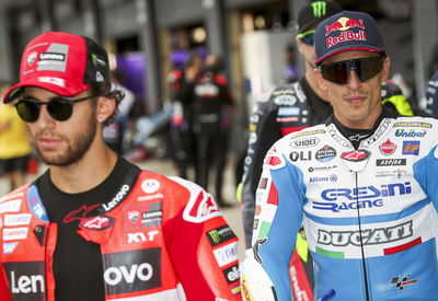
The riders embraced the retro theme with some cool helmet variations, with Enea Bastianini fittingly winning both races at Silverstone sporting a Mike Hailwood tribute lid.
Now, you can somewhat understand why the retro liveries were kept under wraps for most of the weekend. Given most will likely be one-offs, the cost of decking out all of your spare fairings in vintage colours only for them to need to be resprayed again is fairly unjustifiable. And crashing all of those limited parts would have been a costly exercise.
But the stir these liveries caused on social media throughout the weekend should be enough to prompt MotoGP to have a think about how to utilise this more often.
Alternate liveries aren’t exactly uncommon in MotoGP. Gresini for the last few years has run the same retro scheme it used at Silverstone at the San Marino GP, and will likely do so again at Misano (hopefully at both events) this season. At Mugello this year the factory Ducati team ran with a livery celebrating Italy’s national football squad and finished 1-2 in the grand prix on it. Valentino Rossi was also partial to a one-off livery throughout his glittering career
What Silverstone’s throwback liveries showed was how much sponsor logos influence cosmetic design on machinery now. But it also proved you can work sponsor stickers around better designs.
Third kits are commonplace in football leagues around the globe, while in North American sporting leagues like the NHL, alternate jersey games are exciting parts of a team’s fixtures: I personally love whenever the Vancouver Canucks play in their black ‘Skate’ uniforms.
MotoGP should look to copy this. Mandate it so teams must run a special livery in at least three rounds per season. Yamaha, for example, could mark the anniversary of Giacomo Agostini’s 1975 500cc title - the Japanese marque’s first premier class championship victory - by racing with the red and white speed block design it used at Silverstone at select events next year.
Even simply selecting a round every year to be a designated retro livery event would go a long way in giving the championship something unique to promote as part of its brand identity.
While it’s important for MotoGP, particularly when Liberty Media takes ownership, to not get stuck in the past, it would be folly to ignore the fact that nostalgia sells and the hunger for history among fans is always strong.
MotoGP’s retro livery race concept is one the best ideas it has had for a while. Rendering it a one-off would be a massive missed opportunity.
Ranking each team’s retro livery at the British GP
Ducati Factory - 7/10
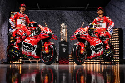
The reigning world champion team raced with a red and white design in homage to the livery that adorned its first MotoGP challenger in 2003. It was among the more simplistic designs seen at Silverstone last weekend, which was very much to its credit. But it didn’t quite live up to the original.
Repsol Honda - 10/10
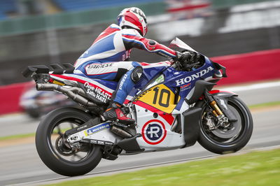
Honda hasn’t won anything in 2024 so far and isn’t likely to scale a podium any time soon with its troubled RC213V. But at least at the British GP it can happily claim to have had one of the best retro liveries of the lot. A not to the early factory colours Freddie Spencer raced to his first 500cc world title in 1983, the rumoured exit of Repsol as title sponsor for 2025 should prompt HRC into seriously considering this retro design for next year.
Yamaha - 10/10
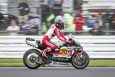
Yamaha also followed the trend of uncompetitive Japanese machine turning out to be one of the most striking when it pulled the covers off of its red and white speed block livery at Silverstone. Paying tribute to a classic design tied to its first 500cc world title in 1975, it’s a livery in some shape or form Yamaha has used occasionally at select events in the MotoGP era and hopefully a reminder to use it again.
Aprilia - 10/10
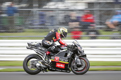
Fears Aprilia would field a retro livery inspired by its woeful RS Cube were thankfully laid to rest when it unveiled a striking ‘Perla Nera’ scheme. Paying tribute to Max Biaggi’s 250cc title treble from 1994 to 1996, it was a simple livery but one that really packed a punch. It was also great to see a black livery in 2024 that was gloss instead of matte.
KTM - 7/10
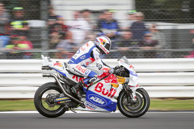
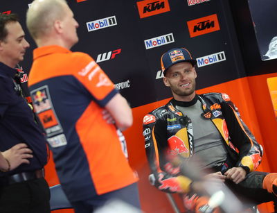
KTM’s effort was a surprisingly good one. Ditching the Red Bull-inspired blue and orange for blue and white, KTM paid tribute to Wolfgang Ferber (now its vice president of technology in the road racing division) and the LC4-engined machine of 1988. While a solid design, it was hard to shake the fact it looked a little like a Stewart Grand Prix Formula 1 car from the 1990s.
LCR Honda - 5/10

This may be a controversial take, but LCR’s efforts were a little underwhelming. Giving its Castrol-backed Zarco bike and Idemitsu-sponsored Nakagami bike retro makeovers, they weren’t huge departures from its usual colours. While use of the old Castro logo on Zarco’s bike was a nice touch, his usual livery is much better.
Pramac Ducati - 8/10
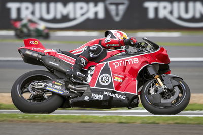
Pramac has been guilty of some truly awful liveries over the past few years, so the Angel Nieto-inspired red and black replacing its ugly purple design of 2024 was a welcome relief for the eyes. Pramac’s retro livery was simple but striking and the team should think about wheeling it out more in future.
Gresini Ducati - 9/10
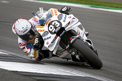
The Fausto Gresini tribute livery the team that bears his name raced at Silverstone is one we’ve seen before at the last two San Marino GPs. And it’s a winner every time it hits the track. The black number plates arguably look better than the retro yellow ones others ran, and the blue and white race suits are gorgeous.
VR46 Ducati - 6/10
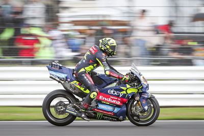
While the VR46 squad’s alternate livery wasn’t bad by any stretch of the imagination, it was just a bit underwhelming given some of Valentino Rossi-inspired designs it could have used. The design looked good on track and the massive yellow 46 across the front of both bikes behind the rider numbers was a lovely touch. But given how much VR46 merchandise already looked like that livery, one can’t help but wonder if this was just a clever way to sell t-shirts.
Tech3 GASGAS - 5/10
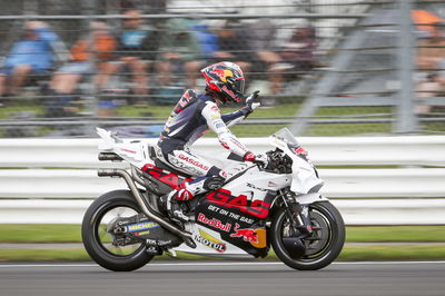
Tech3’s retro livery riffed on the same theme that the factory KTM squad did, but just in a much more muted fashion. It wasn’t bad, but it also wasn’t very exciting either. It also felt like Herve Poncharal’s history in MotoGP wasn’t given the respect it deserved and perhaps allowing his team to use a colour scheme picked from its rich history would have been better.
Trackhouse Racing Aprilia - 6/10
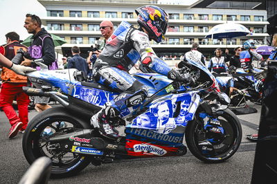
The newest team on the grid didn’t have much history to draw from for its design. Electing to pay tribute to all 11 US-born premier class grand prix winners by putting their faces on the side of the bike was a nice touch. But it would have been nicer to have seen the Nicky Hayden-inspired livery it used at its official team announcement late last year instead.
